Atomic Design: A Practical Introduction to Design Systems

Donata Lesiak
UX Designer
Published:
If you read our previous post, you should know already what a design system is and how it can benefit your business. Within this article, we will explain the modular approach used as the foundation of many design systems – atomic design.
Atomic design – what is it?
Atomic Design is a methodology created by web designer Brad Frost for building design systems from smaller, reusable components. Inspired by chemistry, it breaks interfaces down into five stages: atoms, molecules, organisms, templates and pages.
The idea is simple: rather than designing every screen or page independently, designers and developers create a system of reusable building blocks that can be combined in different ways.
Atoms
Atoms are the basic building blocks of an interface. They're the smallest elements that still have a useful function within the design system.
Examples include buttons, labels, icons, input fields, colours and typography styles. A form field, for example, might begin with separate label and input atoms.
Individually, these elements are simple. Their value comes from defining them consistently so they can be reused throughout a digital product.
Molecules
Molecules are groups of atoms combined to form simple, functional components.
A search form is a common example. A label, search input and button can be combined to create a reusable component with a clear purpose.
Thinking in molecules encourages designers and developers to build smaller components that can be reused in different parts of an interface rather than recreating the same functionality each time.
Organisms
Organisms combine atoms and molecules into larger, more complex sections of an interface.
A website header might contain a logo, navigation and search form. A product listing could combine multiple product-card molecules into a larger section.
These groups of atoms and molecules begin to show how individual components work together within the wider user experience.
Templates
Templates bring components together into page-level layouts.
At this stage, the focus moves towards the overall content structure rather than individual components. A template might establish where the navigation, headings, images, content and calls to action appear without relying on the final content.
This allows teams to test how reusable components behave together across different layouts.
Pages
Pages are specific versions of templates populated with real content.
Replacing placeholders with real text, imagery and data allows designers to see whether the system works under realistic conditions. Long headings, different image sizes or variations in content can expose problems that aren't obvious when working with components in isolation.
Pages therefore don't just represent the finished interface. They also help test whether the underlying Atomic Design system is flexible enough to handle real-world content.
Atomic Design isn't intended to be a rigid, linear process. The five stages work together, allowing teams to move between individual components and the wider interface as they design and develop a product.
Benefits of atomic design
Generally, the main benefits of the atomic design are the same as that of a design system. It makes elements accessible to the team and reusable across a brand’s multiple products keeping them consistent and on-brand. But atomic design also helps teams to create or innovate efficiently and at pace, with the ability to focus on the user’s pain points and improvement of the user experience. The biggest advantage of the atomic design is adaptability to change – like when a client wants to make significant changes in the product — such as a typeface. Without atomic design, each component would need to be changed manually, really slowing down the progress; with it, it’s a matter of a click (well, if done correctly!)
Why use Atomic Design?
The biggest advantage of Atomic Design is consistency. When the same components are reused across a product, users encounter familiar patterns and interactions rather than slightly different versions of the same element on every screen.
There are practical benefits for design and development teams too.
Greater consistency
Shared components help maintain the same visual language and behaviour across different pages, features and digital products.
Faster design and development
Teams can reuse existing components rather than designing and developing common interface elements from scratch every time.
Easier updates
Changes to a reusable component can be reflected wherever that component appears, making design systems easier to maintain as products evolve.
Better collaboration
A shared component library gives designers and developers a common language for discussing how an interface is constructed.
More scalable products
New pages and features can be created from established components, helping products grow without introducing unnecessary inconsistency.
Atomic Design systems are particularly useful for larger digital products where multiple designers and developers need to create new functionality while maintaining a consistent user experience.
How to get started with atomic design
You should start building your system from atoms, then progress with the UI design. However, there is no “one fits all approach”, there are no boxes to be ticked along the way. For example, if you already designed the product and only now decided to build a design system you can take a step back and review all of your components. Cut out all components, look for common patterns, define atoms, molecules, organisms and change the ones that don’t match.
Moreover, there are no strict guidelines on how elements should be organised, if you feel like a button fits under molecules, not atoms, that’s completely fine. The system needs to be functional for the people using it. This is why it’s important to speak to them and discuss their needs and vision at first.
But what is essential to keep in mind is that when we truly design with atomic, the same component is going to be reused in very different contexts. All elements should be generic (a ‘list’ rather than a ‘contact list’) and use consistent, clear naming that reflect the element and its variant/property e.g., atom/colour/blue/90 or atom/button/primary/active.
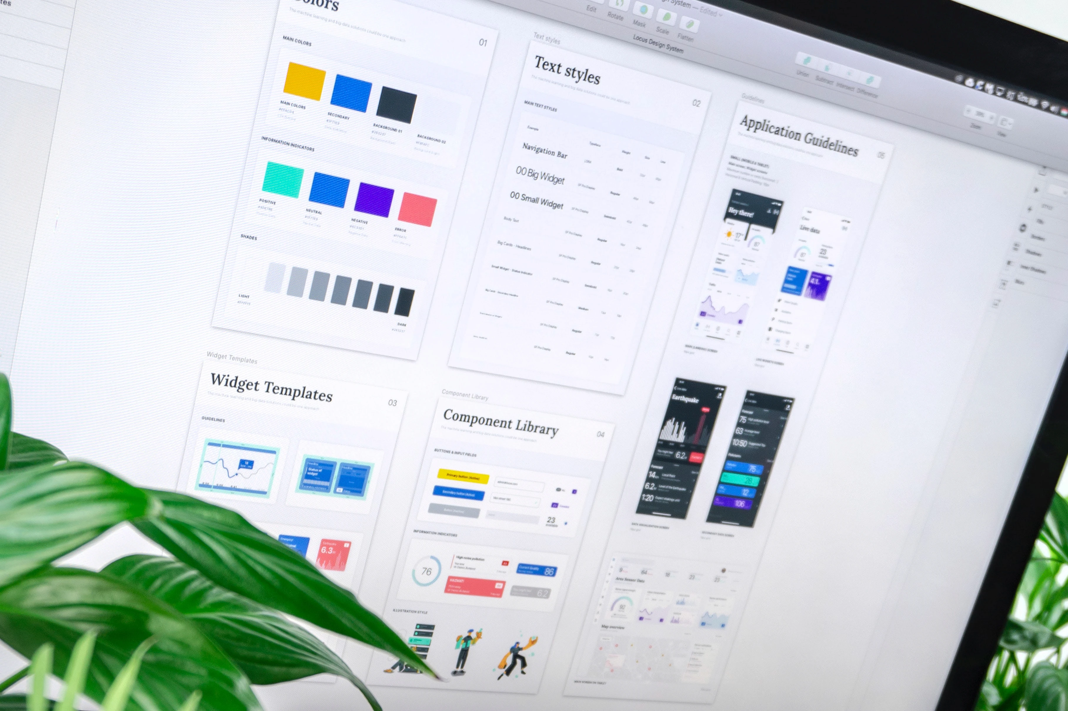
One of the great tools you can use to start building the design system is Figma, the super-powerful design and prototyping tool that we at New Icon have been using for a while now. Features that Figma offers are helpful in creating reusable elements that can be shared with the whole team within the workspace library.
Here are some of the features:
Define global colours, text styles, layout and effects using Figma styles
Create reusable and responsive components using auto layout and constraints
Create components variants and swap instances with ease
Start with real content
Don't wait until the page stage to think about content. Testing components with real content early can reveal problems with different heading lengths, images, data and user-generated content that placeholder text may hide.
The aim isn't simply to create a neat component library. It's to build a system flexible enough to support the real product and the people using it.
In summary, treat atomic design as a mental model that helps you think of a user interface as both a cohesive whole and a collection of parts at the same time. And don’t worry, there is always a place for creativity and design iterations!
Do you want to build your project with an atomic approach? Find out how New Icon can help you implement it and build a comprehensive design system - contact us today.
Donata Lesiak
UX Designer
