{/home/forge/newicon.net/releases/20260715123657/themes/default/pages/_bricks/features/section_trusted_by_brands.tpl}
{/home/forge/newicon.net/releases/20260715123657/themes/default/pages/_bricks/features/section_testimonial_scroll.tpl}
Hello
A subtitle
Within a single session, we moved from a clearly defined problem statement to a working, demonstrable prototype.
The New Icon Hackathon Day was an outstanding example of how focused collaboration can accelerate innovation in certain contexts. Within a single session, we moved from a clearly defined problem statement to a working, demonstrable prototype in this case—something that might otherwise take longer in a more traditional delivery model. What stood out most was the way the team combined design, engineering, and operational expertise in real time whilst maintaining a fun and friendly environment. This wasn’t a theoretical discussion, it was a hands-on, iterative development with continuous validation of both user value and technical feasibility. The hackathon format created the right environment to challenge assumptions and test ideas quickly. My favourite part of the day was when a cheer came from the development team next door working on the solution. They had just finished the working prototype and this clearly showed the great partnership they have, supporting each other to solve the problem! All of this was ultimately ensuring that by the end of the day we had both a tangible solution and a clear view on next steps. It’s a valuable model for driving meaningful innovation based on this experience, and one that I would advocate for use in appropriate contexts as part of future problem-solving and product development activity. "
They took the time to understand our community and vision, and translated it into a prototype that felt real from day one.
Working with New Icon was a genuinely collaborative experience. They took the time to understand our community and vision, and translated it into a prototype that felt real from day one. The process gave us clarity and confidence in what we’re building, and something tangible to share with investors. "
Their attention to detail and ability to break down complex content into digestible, engaging visuals is exactly what we needed.
Working with the Design team and the wider New Icon team has been a fantastic experience. Their attention to detail and ability to break down complex content into digestible, engaging visuals is exactly what we needed. Every edit exceeded expectations and truly reflected what we had envisioned for the final prototype. Highly recommend! "
Each meeting brought real progress and meaningful change, and the team dynamic was warm, collaborative, and easy to work with.
From the very first interaction, New Icon stood out. Their combination of clear, concise documentation and an explanatory video was genius—it gave us immediate clarity and confidence. The Discovery process, especially the Agile Architecture, felt like a genuine offer to help, not a hard sell. Each meeting brought real progress and meaningful change, and the team dynamic was warm, collaborative, and easy to work with. The use of Figma to showcase their design-led approach was impressive, and the achievable PoC cost made things feel within reach. One of the biggest wins? We retained the IP. That was huge. New Icon didn’t just understand our problems, they explained them back to us better than we could ourselves. That alone gave us massive trust in the team and the process. "
New lcon’s deliverables have exceeded our expectations.
We would like to thank the New Icon team for the work accomplished. OnePRESS will be the first wireless safety critical opportunity that will use a mobile application to go to an In-Service Evaluation with Airbus airline customers. As such, there was no precedent for the Landing Gear Design Office to start from. Newicon quickly understood that their expertise could complement our capability to compile design documentation and adapted their process to suit our needs. New lcon’s deliverables have exceeded our expectations. "
Newicon understood our needs, ensuring solutions were current and future-proofed
Ethicall have worked with Newicon for approximately 10 years. During this time Newicon have worked with us on various projects, but predominantly they have helped us design and build a bespoke telephone fundraising software system which encompasses all the nuanced and niche elements of our business. They really took the time to understand what we needed as a fundraising call centre and then constantly revisited this with us to ensure it was still fit for purpose and future proof. The engineers working on the project have always been mindful of building in stages with regular testing and approval from users – they are also able to communicate in non-technical speak – which is always useful for those of us not from a technical background. Newicon’s recent introduction of project managers has enhanced their services further. "
Newicon consistently exceeds expectations, driving innovation as a seamless extension of our business.
Newicon’s ability to over deliver against our expectations and to help drive our innovation has made them an extension of our own business. The team are excellent to work with, and their passion for our business competes with our own. I would recommend Newicon for both your development and design needs. "
You’ve understood the project quicker and got further with the design in 3 weeks than our previous company did in a year.
I’m very impressed with how you’ve interpreted the brief and interviews!
You have captured the use case and functionality really well. "
You've done an amazing job of taking our concept and actualising it into something much more real!
This process has cemented our concepts into requirements, plans and something much easier to step forward with, both internally and as something we can tell the story to others. We've been particularly impressed with how you've taken a fairly niche topic and run with detailed concepts and clearly understood what we are aiming for! "
We're miles ahead of where I expected us to be at this stage, and we've all really appreciated the effort you've put in.
Everyone is really, really happy and pleased with what you've put together, blown away! We love the simplicity of the prototype. "
The project is well thought through, smartly taking into account every little request we had. Which is amazing, I love that!
I've been using the prototype to pitch the idea with potential clients and the feedback has been really good so far. "
We really love the overall look of this
It's a very clean simple interface which still clearly conveys a lot of really important information, so thank you! "
Very happy with the end results and designs for the new features
New Icons redesigns brought the app layout up to date which was amazing to implement over the last year alongside integrating new products into the app. Meeting face-to-face meant that New Icon could properly understand the requirements and turn them into fully functional designs that added to the overall user experience. Very happy with the end results and designs for the new features. "
Newicon is an exemplar of innovation and freethinking.
Newicon's ideas have pioneered mobile software development within my department. Their solutions are innovative and effective producing results above original expectations. "
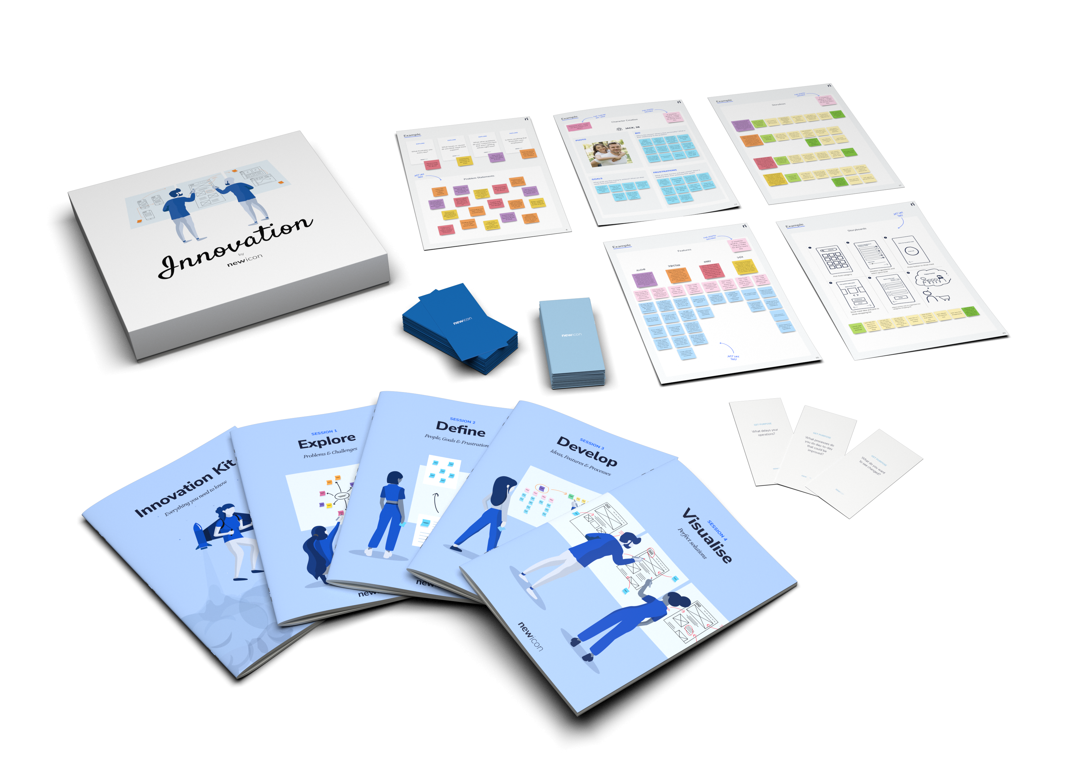
Newicon took the time to fully understand our requirements, and the clickable prototype really helped shape our thinking.
It has been a pleasure collaborating with Newicon on this project. Their commitment, attention to detail and passion for their work has enabled us to produce a quality app and seek further investment. Newicon took the time to fully understand our requirements, and the clickable prototype really helped shape our thinking and produced an intuitive UX, whilst also de-risking the development phase. "
Newicon achieved a 35% increase in business. Newicon really understood what we wanted to achieve.
Very commercially aware and versatile software agency - and a great team to boot!
Newicon give us creative input and state of the art technology
Newicon have helped steer our business in directions we had not even considered. "
Newicon are a great company, they are passionate and always provide a second to none service.
From the design stages through to the technical implementation they understand our requirements as a company. We would highly recommend Newicon to anyone who is looking for a friendly, efficient and professional web and software design company. "
If you need bespoke technology, I highly recommend Newicon.
By working with us to build our platform, they helped lay the foundation for our success. Not only did they develop the software; their process also included UX design and prototyping, ensuring that our final product was user-friendly, secure and powerful. If you need bespoke technology to get your start-up into business, I highly recommend Newicon to deliver it for you. "
{/home/forge/newicon.net/releases/20260715123657/themes/default/pages/_bricks/features/section_case_studies.tpl}
Our Work
{/home/forge/newicon.net/releases/20260715123657/themes/default/pages/_bricks/section/image_left_right_cards.tpl}
The first card title
The second card title
{/home/forge/newicon.net/releases/20260715123657/themes/default/pages/_bricks/section/contact/footer.tpl}Get in touch
Send us a message for more information about how we can help you
{/home/forge/newicon.net/releases/20260715123657/themes/default/pages/_bricks/section/contact/got-a-project.tpl}Where do you want to go next?
From Digital Transformation to Augmented Reality, we can help you build your future. Get in touch with us today.
{/home/forge/newicon.net/releases/20260715123657/themes/default/pages/_bricks/cta/section_cta.tpl}
Get in touch
{/home/forge/newicon.net/releases/20260715123657/themes/default/pages/_bricks/cta/section_message_box.tpl}
Get in touch
Send us a message for more information about how we can help you
{/home/forge/newicon.net/releases/20260715123657/themes/default/pages/_bricks/content/text_aligned_image.tpl}
{/home/forge/newicon.net/releases/20260715123657/themes/default/pages/_bricks/content/section_video_intro.tpl}
Video intro widget
{/home/forge/newicon.net/releases/20260715123657/themes/default/pages/_bricks/content/section_column_blocks.tpl}
{/home/forge/newicon.net/releases/20260715123657/themes/default/pages/_bricks/content/hero_square_icon.tpl}
{/home/forge/newicon.net/releases/20260715123657/themes/default/pages/_bricks/hero/text.tpl}Hello
body hello
{/home/forge/newicon.net/releases/20260715123657/themes/default/pages/_bricks/headers/section_full_header.tpl}
text
text
Typography
prose
For example blog posts are wrapped in prose prose-xl font-normal
Example h1 text
Here is an opening paragraph - some default styling is applied.
Lorem ipsum dolor sit amet, consectetur adipiscing elit, sed do eiusmod tempor incididunt ut labore et dolore magna aliqua. Ut enim ad minim veniam, quis nostrud exercitation ullamco laboris nisi ut aliquip ex ea commodo consequat. Duis aute irure dolor in reprehenderit in voluptate velit esse cillum dolore eu fugiat nulla pariatur. Excepteur sint occaecat cupidatat non proident, sunt in culpa qui officia deserunt mollit anim id est laborum.
That's what she said... hmmm mmm.
An unorddered list
- Item one
- Item two
- Item three
A Second Heading
What shall we get at the shops?
<div class="prose font-normal">
	<h1>Example h1 text</h1>
	<p>Here is an opening paragraph - some default styling is applied. </p>
	<p>Lorem ipsum dolor sit amet, consectetur adipiscing elit, sed do eiusmod tempor incididunt ut labore et dolore
		magna aliqua. Ut enim ad minim veniam, quis nostrud exercitation ullamco laboris nisi ut aliquip ex ea
		commodo consequat. Duis aute irure dolor in reprehenderit in voluptate velit esse cillum dolore eu fugiat
		nulla pariatur. Excepteur sint occaecat cupidatat non proident, sunt in culpa qui officia deserunt mollit
		anim id est laborum. </p>
	<blockquote>That's what she said... hmmm mmm.</blockquote>
	<p>An unorddered list</p>
	<ul>
		<li>Item one</li>
		<li>Item two</li>
		<li>Item three</li>
	</ul>
	<h2>A Second Heading</h2>
	<p>What shall we get at the shops?</p>
</div>
Here is text xl a long paragrph - its improtant to see if the default text size matches the default text line-height and some more text to check large blocks. And even more text can go here and even more here
<p class="text-sm">Here is text xl a long paragrph - its improtant to see if the default text size matches the default text line-height and some more text to check large blocks. And even more text can go here and even more here</p>
Here is text xl a long paragrph - its improtant to see if the default text size matches the default text line-height and some more text to check large blocks. And even more text can go here and even more here
<p class="text-md">Here is text xl a long paragrph - its improtant to see if the default text size matches the default text line-height and some more text to check large blocks. And even more text can go here and even more here</p>
Here is text xl a long paragrph - its improtant to see if the default text size matches the default text line-height and some more text to check large blocks. And even more text can go here and even more here
<p class="text-lg">Here is text xl a long paragrph - its improtant to see if the default text size matches the default text line-height and some more text to check large blocks. And even more text can go here and even more here</p>
Here is text xl a long paragrph - its improtant to see if the default text size matches the default text line-height and some more text to check large blocks. And even more text can go here and even more here
<p class="text-xl">Here is text xl a long paragrph - its improtant to see if the default text size matches the default text line-height and some more text to check large blocks. And even more text can go here and even more here</p>
Here is text xl a long paragrph - its improtant to see if the default text size matches the default text line-height and some more text to check large blocks. And even more text can go here and even more here
<p class="text-2xl">Here is text xl a long paragrph - its improtant to see if the default text size matches the default text line-height and some more text to check large blocks. And even more text can go here and even more here</p>
Here is text xl a long paragrph - its improtant to see if the default text size matches the default text line-height and some more text to check large blocks. And even more text can go here and even more here
<p class="text-3xl">Here is text xl a long paragrph - its improtant to see if the default text size matches the default text line-height and some more text to check large blocks. And even more text can go here and even more here</p>
Here is text xl a long paragrph - its improtant to see if the default text size matches the default text line-height and some more text to check large blocks. And even more text can go here and even more here
<p class="text-4xl">Here is text xl a long paragrph - its improtant to see if the default text size matches the default text line-height and some more text to check large blocks. And even more text can go here and even more here</p>
Here is text xl a long paragrph - its improtant to see if the default text size matches the default text line-height and some more text to check large blocks. And even more text can go here and even more here
<p class="text-5xl">Here is text xl a long paragrph - its improtant to see if the default text size matches the default text line-height and some more text to check large blocks. And even more text can go here and even more here</p>
Here is a big heading
<h2 class="text-6xl">Here is a big heading </h2>
Here is a big heading
<h2 class="text-7xl">Here is a big heading</h2>
Here is a big heading
<h2 class="text-8xl">Here is a big heading</h2>
Here is a big heading
<h2 class="text-9xl">Here is a big heading</h2>
Italic Callouts
<b class="ni-emphasis text-2xl">Hey, This is really nice to look at!</b>
<b class="ni-freehand text-2xl">Hey, This is really nice to look at!</b>Buttons
<div class="mt-10 max-w-3xl mx-auto space-y-4 flex flex-col items-center justify-start sm:space-y-0 sm:flex-row sm:items-end sm:justify-around">
	<button type="button" class="btn btn-primary btn-xs btn-fx-shadow">Button text</button>
	<button type="button" class="btn btn-primary btn-sm btn-fx-shadow">Button text</button>
	<button type="button" class="btn btn-primary btn-md btn-fx">Button text</button>
	<button type="button" class="btn btn-primary btn-lg btn-fx">Button text</button>
	<button type="button" class="btn btn-primary btn-xl btn-fx">Primary button</button>
</div>
Colors
LightGray
Gray
Blue
Purple
Pink
Red
Orange
Cards
simple cards
Turn your ideas into a reality
Rapid progress & visual results
A people-centric design process
Beautiful visual design
Feature cards - borderless
A borderless feature card expands to its container and has no default border - this can be determined by its parent template
Turn your ideas into a reality
Workshops
Rapid progress & visual results
Prototypes
A people-centric design process
User experience Design
Beautiful visual design
User Interface Design
Feature cards - borderless inside a container
Turn your ideas into a reality
Workshops
Rapid progress & visual results
Prototypes
A people-centric design process
User experience Design
Beautiful visual design
User Interface Design
Feature Skewed cards
Turn your ideas into a reality
Rapid progress & visual results
A people-centric design process
Beautiful visual design
Beautiful visual design
User Interface Design
We design user interfaces that are as intuitive as they are beautiful. And we think both are equally important. Ease-of-use is integral to a smooth user experience, while carefully-crafted aesthetics make your project stand-out from the crowd and stick in the mind.
Icons